Blog Update (It lives, it dies, it lives again!)

Just wanted to give a head’s up here that I moved my blog over to Netlify/Hugo, In case anyone is still following this on RSS or anything like that. My main reasoning was I wanted to be able to take more advantage of the Blogdown package and make it a little easier to get content out. And all the cool data scientists are using it, so, you know, peer pressure and stuff.

The link to my new blog is here. I’ve already got a few posts up. One of Lonzo Ball’s alleged inflated assists, and another about my experience using Tensorflow to predict movie revenue.

Famous last words, but I think I’ll be able to get more content out in this new setup. The site is linked directly to my github, so it’s just easier to post stuff. Also, last year was crazy for my family with my wife having a liver transplant, me changing jobs, and my son having a major seizure that landed him in the hospital for a week, so obviously my blog was a very low priority. Fingers crossed, life will be a little smoother this year.

Here’s to more nonsense content in the upcoming year! Thanks for following to all 5 of you!.

Blog Update (It lives, it dies, it lives again!)

Data Science-ing The Bachelor Season 21

Intro

2017 is going to start off with a pop culture bang. No, I’m not talking about the Inaugurtation (it’s not pop culture if no celebrities are there, right?), the CFP Final, or even the NFL playoffs. I’m talking about the Bachelor, of course Since 2002, we’ve watched reality TV’s finest compete for love and the opportunity to break off an engagement with that special someone 6 months later.
Why, you ask, would this matter for a data science blog? Inspired by Alice Zhao’s analysis, I wanted to look at how the numbers for this season compared to others as well as predict some of the season’s outcomes so I can win my office fantasy league! While, it turns out, there are a lot of blogs and resources devoted to examining data within sports, pop culture, politics, society, and many other things, there is not a lot of data science devoted to understanding and predicting the Bachelor! I, as a citizen data scientist, could not let this stand.

Methodology – What did I do?

I scraped data from the Wikipedia pages for as many seasons of the Bachelor as had pages. These tables had age, hometown, and occupational information about bachelors as well as contestants. From this info I calculated age differences and hometown distances between contestants and bachelors. All of this was thrown into a model to estimate the probability of each contestant getting a hometown date, and getting the final rose. I left out seasons 9 and 12 from the analysis (seasons with an Italian and English bachelor), as the distance variables are fundamentally different for those seasons.

Descriptives

Age

Nick’s age has been a source of controversy heading into this season. Both Chad and Robby had things to say about it. But how does Nick’s age actuallly compare to those of previous Bachelors?

bach_age

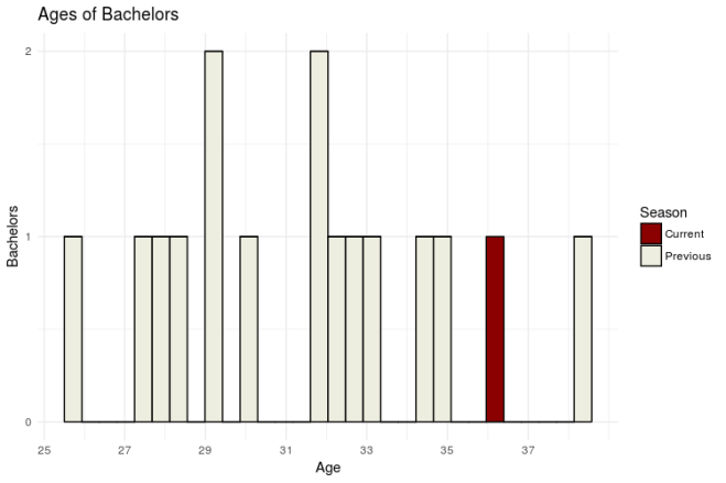
Surprisingly, Nick, at 36, is not the oldest! That honor goes to Brad Womack, who was 38 during his second go round. Hey, if it works for Brad*, it can work for Nick, right? Right? …

Anyway, lets take a look at how the age distribution of current contestants compares to that of previous seasons.

contest_age

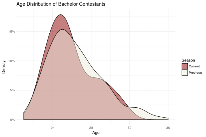
Interestingly, the age distribution for this season isn’t much different than that of previous seasons. If anything, it skews a little younger. That should make for an interesting dynamic this season! (We’ll see if the old “Hi, I’m Nick and I was likely in Middle or High School when you were born, isn’t that crazy?!” pick up line works).

Occupations

To categorize contestant occupations, I created a series of dummy variables for common contestant occupations (manager, nurse, sales, student, etc.). The following graph compares the number of contestants within each occupation this season with the average number of contestants in each occupation for all previous season.

contest_occ

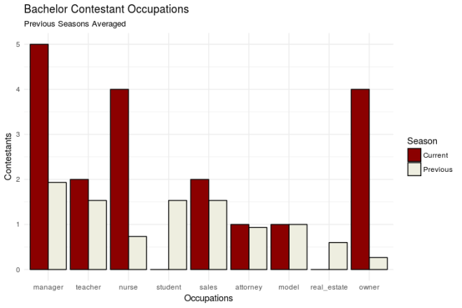
We have some BOSS ladies this season! The categories that stand out most are Manager, Nurse, and Owner. I’m so looking forward to the squabbles about whose business is bigger (detailed under the ‘Sickest Burns’ section here)

Geography

Where are contestants from this year? Let’s map it out and see. Note: This map obviously leaves out some contestants from previous years. For the sake of this analysis, I just wanted to focus on the continental US in order to more easily spot any variation

contest_map

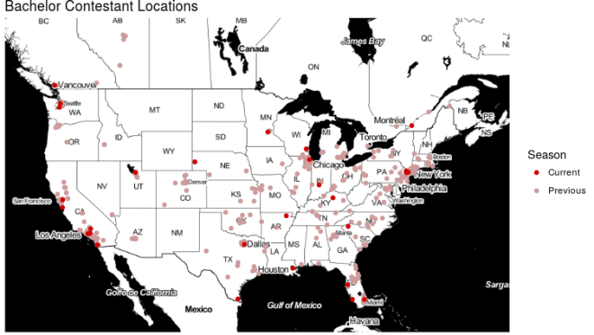
Overall, it doesn’t seem like there are any substantial breaks from previous seasons. Geographically, the Bachelor is an equal opportunity show! But how far away are this season’s contestants compared to previous seasons? Will they have to overcome quirky regional quirks moreso or less than we’ve seen in the past?

contest_diff

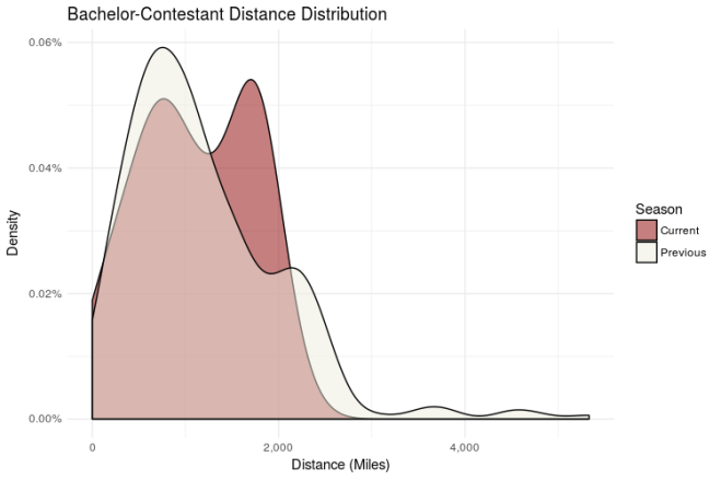
The bimodal distribution here is interesting. Nick’s got a larger proportion of contestants from ~2,000 miles from his hometown (Milwaukee, Wisconsin). From this and the map above, it looks like there are two distinct groups here: Middle America (mode 1), and Everyone else (mode 2). Something to keep an eye on as the season goes on.

Model Prediction (Come on, Aaron, who’s gonna win!?)

To predict final rose and hometown date probability, I trained a model on all available previous seasons using contestant age, age difference to bachelor, occupation (a series of dummy variables), contestant geographic region (based on a clusting of hometown locations), and distance between contestant and bachelor hometowns as the varaibles in my model. It turns out these variables aren’t SUPER predictive of getting a final rose or a hometown date (~.57 AUC for final rose and ~.50 AUC for hometown date for reference, a model with a .50 AUC score performs about as well as just randomly guessing), so don’t go betting your house on the results here. Shocker, I know. With that said, let’s take a look at the maybe-slightly-better-than-random-guessing output!

contest_prob

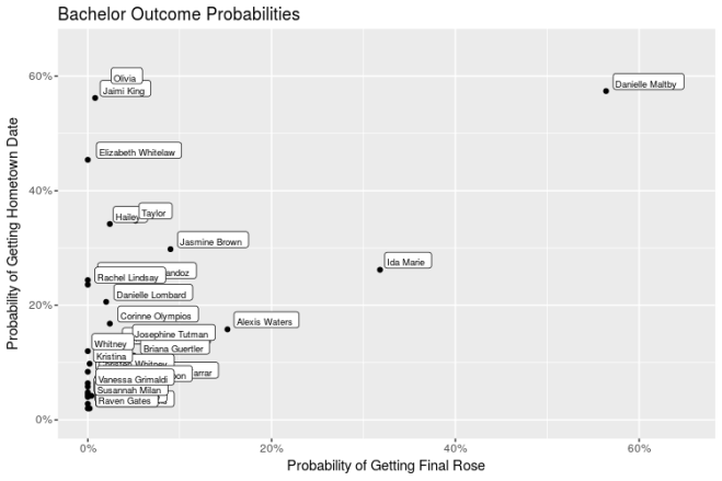
The clear favorite hear seems to be Danielle Maltby. What is likely driving this is that she is 31 (small age difference from Nick), originally from Wisconsin (though her ABC bio says Nashville), and she’s a Nurse. The pretenders look to be Olivia, Jaimi King, and Elizabeth Whitelaw; these three have high hometown date probabilities, but substantially lower final rose probabilities. Ida Marie is a bit of a sleeper, with the second highest final rose probability, but middle of the road hometown date probabilities. (Let’s hope her literary humility helps separate her from the pack!)

Conclusion

Danielle M is our girl! Now that data justice has been served to the Bachelor. This was my first interation of the model and, as I’m sure results Monday will show, there’s a lot of room for improvement. There definitely need to be more features added (likely extracted from Bio text or something along those lines) and hopefully I’ll be able to get that up before the Bachelorette later this year. If I could get my hands on the data, it would also be a lot of fun to calculate in-season win probabilities (e.g. Oooh, Danielle L., got put on the week 3 group date, that incrases her chance of winning by 4% pts!). If we wanted to be extra judgy, I could also build a model that predicts a successful marriage and we could contrast that with final rose probability (JoJo would have had a higher chance at a successful marriage with Luke and we all know it!).

Anyway, this was a ton of fun, and I’m hoping to continually track how wrong I am throughout the season!

*It didn’t work for Brad

Code at my Github

Data Science-ing The Bachelor Season 21

A Sentiment and Tonal Analysis of the First Presidential Debate

It’s been about a week since the first debate between Donald Trump and Hillary Clinton, and data scientists have gone to TOWN on the transcript of their debate. (Check out analyses here, here, here, and here for some awesome examples). The majority of these analyses focused on which candidate spoke the most, which words did each candidate use and how often, and how long each candidate spoke.

Rather than rehash some of the same topics, I wanted to look at the sentiment (to what extent were a candidates statements positive or negative?) and tone with which each candidate spoke (emotional, language, and social tone). To do this, I used Columbus Collaboratory’s CognizeR package, which calls on IBM Bluemix services. Sentiment will allow me to examine what the overall positivity and negativity of the whole debate was, and which candidate went more in each direction. The tonal analysis will allow me to look into how each candidate tries to get their ideas across. The data I used was from this Kaggle Kernel

In terms of sentiment, the distribution shows that Trump’s statements tended to be more negative than Clinton’s. The distribution of his statements has a large (yuge?) peak in the negative score range, with a tiny peak in the positive range. Clinton’s distribution is more even, there’s about an equal peak for both positive and negative statements.sentdist

Overall, Trump had 84 negative statements and 30 positive  (2.8 negative per 1 positive) while Clinton had 44 negative statements and 36 positive (1.2 to 1). At a general level, this is not surprising given each campaign’s orientation to American Greatness. If America needs to be “Great Again”, then a candidate is likely to point out all the things currently wrong in the country and vice versa for a candidate who thinks America is “Already Great”. Even taking that all into account, however, it is still a bit staggering to see Trump giving twice as many negative statements as Clinton.sentscore

In terms of emotion tone (think Pixar’s Inside-Out), there wasn’t as large a discrepancy as there was in sentiment, but there still were some interesting differences to point out. The largest difference between the two candidates was Clinton having a higher ‘joy’ score than Trump, even though both scores relatively low on the measure. I was expecting to see a bigger difference in the ‘disgust’ emotion, but one might have to dig into each candidate’s tweets and subsequent about Alicia Machado to find that.emotionaltone

For language tones (examining a Candidate’s speaking style) , Clinton scores higher in ‘Analytic’ and ‘Tentative’ scores, and Trump narrowly beats her out in ‘Confidence’. Again, this is not surprising. Depending on who you talk to, Clinton’s analytic style is one of her biggest strengths or weaknesses; she brings in a lot of facts and specific policies, but some interpret that as ‘lecturing’ or ‘speaking down’ to audiences. I’m not quite sure exactly what to make of the difference in tentativeness. My guess is that tentativeness goes hand in hand with an analytic mindset, the more you examine something, the more you realize what you do and don’t know about it, and then you have to communicate with that in mind. I’m certainly open to other interpretations of that.languagetone

Finally, differences in social tones (adopted from Big Five personality traits) show that Trump had higher scores for Agreeableness, Emotional Range, and Extraversion while Clinton had higher scores for Conscientiousness and Openness. I was surprised by Trump’s higher score on Agreeableness, as he seemed to be more flustered as the debate went on. The overall pattern that stand out to me (and it’s present in the Social Tones graph as well as the Emotional Tones graph) is that for tones with higher values, Trump scores higher than Clinton, but for tones with lower values, Clinton scores higher than Trump. In other words, if you put a line through the center of those two graphs, Clinton would always be closer. I think this fits into the main narratives for and against each candidate’s personality: Clinton is less variable than Trump. If you want to stay the course, Clinton is likely for you, if you want to shake things up, Trump is your guy.

socialtone

I hope this has been informative for you all. It’s always a lot of fun to dig into this kind of data and extract insights. As I noted previously with my Colin Kaepernick Analysis, using IBM Watson within R makes this kind of text analysis a breeze. For anyone who wants to work with this data WITHOUT having to query IBM Bluemix yourself, I’ve added the dataset with each candidate’s statements, their sentiment, and each tonal score (along with my code) to my Github


A Sentiment and Tonal Analysis of the First Presidential Debate

What are people saying about Colin Kaepernick?

As you have likely heard, at the 49ers game last Thursday, Colin Kaepernick decided to sit out the national anthem as a protest against police brutality and racial discrimination. As this is a hot button issue, this action predictably set off a social media firestorm, with some praising Kaepernick for his courage in standing up for a cause he believes in, and others calling him out for his lack of respect for the country, the military, and police officers. I wanted to take the opportunity to dig into what people are saying  and see if we can understand the varied reactions to this polarizing event.

To do this, I leveraged a new tool called Cognizer, an R package developed by Columbus Collaboratory that links directly with IBM Watson to provide easy services like text analysis in R. This service provides sentiment analysis, keyword matching, emotional scoring, personality insights, and tone analysis. Ideally, this can provide deeper insights into various aspects of what people are saying about Colin Kaepernick and how they’re saying it. However, since the API limits are fairly stringent for free users (1,000 calls a day), you have to pay to play if you want to examine lots of text, and so I limited my analysis to about 300 tweets in order to fit everything in. Even with that limitations, I was still pretty impressed with the services these packages provide and hope this work gives somewhat of a sample if you were trying to check it out! In this analysis, I focus on the sentiment and emotion functions available in Cognizer.

Starting with sentiment, overall what sentiment are the tweets about Colin Kaepernick? The plots below suggests that they are negative a little over twice as much as they are positive. KapTweets1KapTweets2

If you’ve seen tweets about him, this is not super surprising. Even when someone is supporting Kap, they can be doing so in a negative say. For example, @LongLiveKermy said “So many racist hate tweets toward Colin Kaepernick thus proving he was entirely right for not standing.” which scored as negative sentiment, but is actually a tweet in support of Kaepernick, so his support might be a bit understated here. (I will note that even though tweets like this popped up a few times, they were few and far between; IBM Watson does a good job of correctly identifying sentiment).

What about emotions? This service scores each tweet on 5 emotions: fear, anger, disgust, sadness, and joy (just like Inside Out! RIP Bing Bong). Below is the distribution for each emotion. The one that stands out the most is disgust. Anger and sadness are the next two common emotions, with fear and joy bringing up the rear.KapTweets5

But how do these distributions vary by tweet sentiment? The distributions aren’t quite as different as one would expect. The main difference that stands out is among joy, as there is a very right skew for negative tweets, but the distribution is more or less flat for positive tweets. When looking at median emotional scores by sentiment, joy has the largest difference between positive and negative tweets. What is interesting as well is that disgust, on average, scores the highest for both positive and negative tweets. I’m no psychologist, but I think this provides some pretty good insight into how the country reacts to these polarizing events, we’re likely to either be disgusted by the action being protested or by the protest itself.  In this sample, many people are showing support for Kaepernick by expressing disgust for the issues he is sitting down for, or they’re disgusted with him for doing so. Obviously I’d need more than 300 tweets to fully infer that, but I thought it was a potentially interesting directional read.

KapTweets3Kaptweets4

I had a lot of fun working with this package and on this topic. In the future, I hope to delve into the package a little deeper to check out tone and personality analysis, either on this topic or some others (likely related to the election).Overall, I thought the package was really easy to use and provided some good insight into an important topic.

Update: Code at my Github.


What are people saying about Colin Kaepernick?

Game Changers: Assessing QB Win Probability Added using R.

Up until now, most of my sports analytics have focused on basketball (my favorite sport). But this blog should be more sport-agnostic, and I just got my hands on some data from Armchair Analysis (which I would HIGHLY recommend) and figured I’d give some football analytics a spin!

One metric that has intrigued me across multiple sports is Win Probability Added (WPA). Essentially, this metric measures the effect a player has on the chances of their team winning the game. I like WPA because it devalues garbage time stats and places more value on clutch plays. If my 49ers have a 34% chance of winning a week 3 game against the Cardinals, and Colin Kaepernick throws a pick-6, their probability of winning the game is now 18% and he is attributed a WPA of -16% for that play. If, four plays later, he throws ANOTHER pick-6 and the team’s probability of winning the game drops to 9%, he is attributed with a WPA of -9%.

Brian Burke does a good job of detailing this metric’s application in football here, and Mike Beuoy has done some extensive work on it’s application in basketball here.

To replicate WPA on my own data, I took every play available from Armchair Analysis (All plays since 2000 season) and, using metrics such as Vegas spread, score, time left in game, field position, and quarter, used a GBM classifier to predict the probability of a home win for each play (BTW shoutout to H2O for making this extremely easy to do). With some simple data wrangling, I could figure out the Win Probability for each play in the database and how each player affected their team’s win probability. This is probably familiar to most, but I posted an example game in Plot 1: That’s the in-game win probability chart for Super Bowl 50.

Plot1WinProb

Since it’s the offseason (kind of) and ranking players is the thing to do right now, how did 2015 QBs stack up against one another, factoring in both passing and rushing?  On a personal note, my 49ers are in the middle of a QB battle (if you can call it that?); Blaine Gabbert and Colin Kaepernick had fairly similar stats last year, will this metric provide some separation between the two? Plot 2 has the answer to that.

Plot2QBRank

No surprise, but Aaron Rodgers and Carson Palmer lead the way with Matt Cassel and Zach Mettenberger bringing up the rear. Two things initially stand out to me. First, I knew Kirk Cousins had a really good season, but I did not expect to see him #3 on this list. Second, I knew Peyton Manning wasn’t great last year, but I did not expect to see him so low. As for the 49ers, the first takeaway is that both options aren’t great, but this metric gives the edge to Kaepernick.

Let’s dig a little deeper into the Blaine Gabbert-Colin Kaepernick comp. Because this data is play by play, we can plot the distribution of each QB’s WPA. That is shown in plot 3.

Plot3GBCK.png

While the two distributions don’t look radically different, a few things stick out. Gabbert is really hurt by outliers; even though Kaepernick threw multiple pick-6’s in week 3, they don’t hurt him too bad because a)they were thrown early in the game and the team still had a chance to make a comeback and b) the team was not favored to win the game, so their win probability was fairly low to begin with. As you can see, most plays don’t have a huge impact on the game, but Gabbert has a higher proportion of these types of plays on the negative side. I’d have to looker deeper into these numbers, but I imagine a lot of his checkdowns while the team was trailing explains this.

Blaine Gabbert and Colin Kaepernick aren’t great QBs, so looking for differences in their WPA distributions is a bit like splitting hairs. What does a good QB look like in comparison to a bad one. To do this, I compared Blaine Gabbert to Tom Brady in Plot 4:

Plot4BGTB

It can be tough to give a full comparison of these two because Gabbert only played half the team, but you can definitely see some differences here. Brady is helped by a big positive outlier, but also due to the fact that a much higher proportion of his low-effect plays are positive; Brady consistently increases his team’s chance of winning, even if it’s just by a little bit.

There’s a lot more to unpack with this data, and I’m excited to dig in more in the future. For example, which QB had the best WPA season since 2000? We can also look at other positions, which RBs, WRs, TEs, or Defenses had the best WPA? Which penalties had the biggest cost on WPA? This was my first foray into football analytics and it was a lot of fun! I hope to answer some more of these questions on the blog in the future.

Code at my Github

Game Changers: Assessing QB Win Probability Added using R.

Using Cohort Analysis to measure NBA Draft Value

Every year during the NBA off-season, analysts debate how good or bad the players in that year’s draft will be. Every year we get cautioned that you really can’t evaluate a draft until 3 years later. However, aside from the occasional post about redrafting, I don’t see too many posts evaluating drafts multiple years later. Even for redrafts, the focus is on ‘what ifs’, which are interesting (and painful, I’m a Kings fan and we took Thomas Robinson and Jimmer Fredette instead of Kawhi Leonard and Damian Lillard, yikes), but don’t necessarily evaluate the draft as a whole.

For this post, I want to look back at previous drafts and see how productive they have been over their lifetime and answer the questions

  • 1a) Are there good and bad draft classes?
  • 1b)How far are they separated in terms of win shares produced.
  • 2) How many seasons does it take to evaluate a draft class

To do this, I use data from basketball-reference.com and use cohort analysis to examine the win shares produced in each season  by each draft class over the past 15 years. Results are plotted below.

Rplot03

Plots 1  answers question 1a. Drafts 2003, 2008, 2009, and 2011 visually stand out as providing more win shares than others. Drafts 2000, 2002, 2006, and 2010 stand out as poor drafts. Plot 2 looks at the same information in line graph form. As both plots show, there are definite tiers between good drafts and bad drafts, addressing question 1b. Honestly, I was take aback by how big the differences in terms of win shares are. For example, the 2011 draft class produced 148 win shares their 4th year in the league (the most produced by a draft class in a single season). In contrast, the 2002 draft class only produced 68 win shares their 4th year in the league, less than half the win shares of the 2011 draft. Similarly, the 2010 draft only produced about 60% of the win shares of the 2011 draft. A less extreme comparison (Drafts 2000 and 2009) shows that the poorer draft was only 75% as productive as the better draft in year 4. In sum, there definitely are good drafts and bad drafts, and the difference is rather large: a bad draft can literally be half as productive as a good draft in extreme cases and less than 75% as productive typically. ws_lt_line
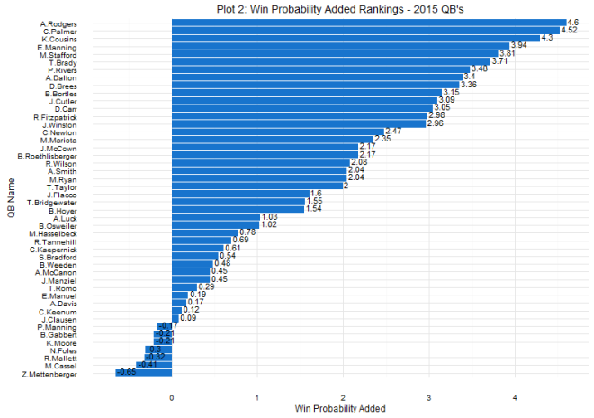
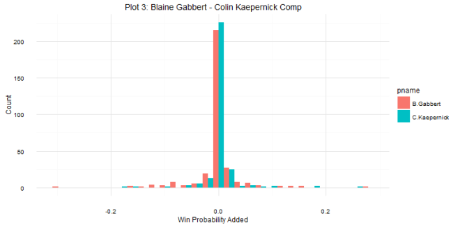
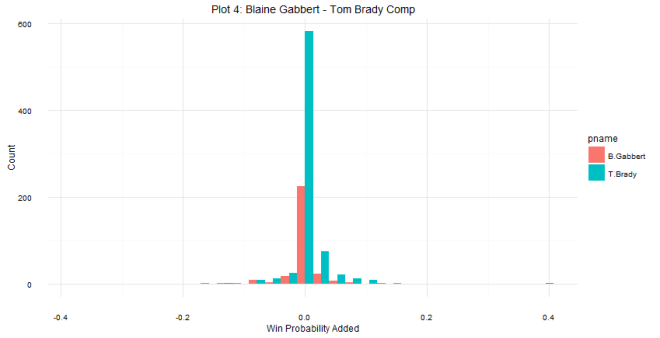
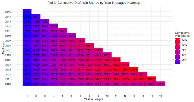
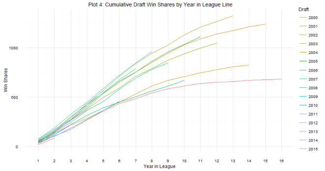
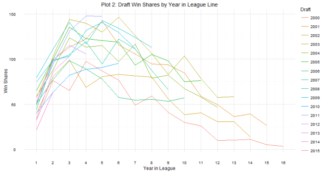
As for question 2: when can we tell whether or not a draft class is good or not? The answer is a little more complicated. Plot 2 shows that there are some win share discrepancies show up as early as year one. However, you do see some shuffling as years go on. For example, the 2008 draft started out really hot (Derrick Rose, anyone?), the most win shares produced in years 1 and 2, but kind of leveled off after that (Derrick Rose, anyone?). In contrast, the 2011 draft started out slow (Lockout, anyone?), but produced the most single season win shares by a draft class in year 4. The curve in Plot 2 shows that draft classes reach peak production around years 4 and 5, which is probably the best time to evaluate the goodness and badness of the draft class. It can be tempting to try to evaluate after year 1, but there are many instances of draft classes making up ground. Plots 3 and 4 show this. The 2006 draft produced 7 more win shares than the 2007 draft class in year 1, but by year 5, the 2007 draft class had produced almost 70 more win shares. One might be tempted to look at the 2014 class and say they are doomed, but remember Jabari Parker, Joel Embiid, and Julius Randle all missed pretty much the whole season, and in the long run, the win shares produced by those players could make up some serious ground. Rplot04.png

While there is some important sorting that goes on in years 4 and 5, I think one has to wait even longer to get a more concise evaluation. Plot 4 shows that some differentiation occurs later down the road. Right now, the 2011 draft is in a dead heat with the 2003 draft for best draft class. We won’t know which is better until some more careers have taken shape. How is KD going to affect Klay Thompson? Does Kawhi take another step with Duncan retiring? We won’t have a definitive answer of which draft was better until these and other questions play out, which will take years.Rplot05

Overall, using cohort analysis and some simple visualizations, I showed that there are good and bad drafts, the difference between the two is substantial, and that evaluating draft classes takes at least 4 years, and probably longer if you want to be more concise. While this has been a good learning experience, it’s led me to ask a lot more questions, the answers to which will hopefully come soon! Thanks for reading!

Data from Basketball Reference

Code at my Github


Using Cohort Analysis to measure NBA Draft Value

Mapping Forbes data in R

Hi All,

Sorry it’s been so long since I’ve posted; life has been a little crazy in the Miles household! (More on that here).

Alex Bresler just created a wrapper for the new Forbes API (see his blog post here). I was playing around with it and found that there’s a lot of good data there! I thought I’d share an example of how you can use this wrapper in conjunction with Ari Lamstein’s choroplethr package to map some of this data. I chose to plot the Forbes list ‘Best Cities for Business’ by state, but between these packages, there are so many options!

forbesBusinessCities


For the most part, this echoes a population map (an issue with many national maps). California, Texas, and Florida are the clear leaders here. Let’s look at the same map from a per-capita perspective to control for state populations.

BestCities2.R

In this plot, New Hampshire, the Mountain West/High Plains and the South start to look a lot better than they did on the previous plot. I wouldn’t pretend to know what exactly this information means in terms of state policy toward business,  but these easy visualizations make it a lot easier to get the right information!

Most importantly, I think these packages and examples illustrate why the R community is so great. I don’t really know much about web scraping, or mapmaking, but these packages make it muuuuch easier to access and visualize data from various sources. Blog posts that contain code (like Julia Silge’s here) provide awesome examples and templates. The R community is seriously awesome.

Code posted at my github

Mapping Forbes data in R

The Data-Driven way of selecting your Star Wars home.

Intro

“My knees hurt, and I wish I was younger.” If I can a dime for every time I’ve heard this from the guys I play basketball with…

If they are any indication, joint health and aging are two big issues for the population. Wouldn’t it be nice if we could find a planet that’s easier on the joints AND on the birthdays? While NASA is indeed discovering planets that may support life, we won’t be able to get there in any of our lifetimes. What’s the next best thing? STAR WARS!!!

Where to Live

To find our perfect planet, I pull data from the Star Wars API , a data source created by Paul Hallet containing data on the people, species, starships, vehicles, planets, and films in the Star Wars canon. I access this data in R through the helper library ‘rwars’ created by Oliver Keyes. I’ve also created some R functions that return cleaned data frames any R programmer can use to jump right into analysis.

What would this ideal planet look like? First, we’d want lower gravity so as to relieve pressure on joints like knees. Second, we’d want a planet with a long orbital period, so as to make birthdays as scarce as possible (While I can’t mess with space-time, I CAN lower that age number!). Using those two criteria, we’re going to find this knee and age friendly planet.

oper_grav

Unfortunately, as you can see from the scatterplot, there doesn’t need to be a single planet that is both low in gravity, but high in orbital period. What we do see however, is a planet to avoid: Malastare (Yuck). As this point, you have the decide which is more important, having a lower age, or having your knees not have to be replaced. If age is more important, you should head for Yavin IV or Bespin (Cloud City), both of whose orbital periods are approximately 5,000 standard days long.  For example, I am 27 now. If I was living it up with Lando in Cloud City, I’d only technically be 1.9 years old!

However, age is just a number, but knee pain is for real. Looking at a planet’s gravity level, three planets stand out, Polis Massa, Trandosha, and Felucia. Polis Massa might be a bit misleading, since it’s actually an asteroid with a medical facility on it (It’s where Luke and Leia were born, so I’m sure there’s a burgeoning tourism industry, which is something). For the introverts out there, it might be just what you are looking for. Trandosha seems nice too, with its arid climate and grassy, mountainous landscape. The downside is that these guys are going to be your neighbors. Lastly, we come to Felucia. This planet is hot and humid with some insane fungus forests. It’s description on Wookiepedia talks about there being some bases there, so this wouldn’t be a Dagobah situation or anything. Depending on if you’re looking for a tropical climate or arid grasslands, Felucia or Trandosha are your best options.

How to get There

But how do you get there? Elon Musk is the man, but I don’t think SpaceX is quite ready to tackle intergalactic travel. Fortunately, the Star Wars API provides us with lots of useful information about potential transports. One important characteristic is how quickly we can get there, so we’ll need to look at each ship’s hyperdrive rating. We also have to make a decision about whether it’d be best  to buy a ship, or see if we can book passage on a larger transport, so we need to look at the human capacity of ships in order to compare the speeds of small fighters vs the bigger transports. We’re also not made out of money, so we’ll need to look at how much each ship costs.

hdrive_tcap

The graph above compares the hyperdrive rating with total capacity. In regards to speed, there are three ships that stand out: The Belullab-22 Starfighter, a one-person starfighter (the ship Obi-Wan escaped on in Revenge of the Sith), the Rebel Transport (total capacity of 90), and the Slave One (Boba Fett’s ship).

hdrive_cost

Looking at cost, If you’re looking to buy a ship, the Belullab-22 is the best bet. As one-person fighters go, it’s pretty cheap and it has a hyperdrive rating second to none. If you can’t get your own ship, there are a few options for traveling as a passenger. First and foremost, you might want to avoid travelling on the Slave One because there’s a good possibility you’d be making the trip as a block of carbonite (though Boba Fett DID show concern for Han being alive, so there’s that). The Rebel transport will get you there quickly, but since there’s only 90 seats aboard, those tickets are likely to be pretty pricey. The CR90 Corvette and the EF76 Nebulon-B Escort Frigate are going to have more economy seats, but it’s going to take you a bit longer to get to your destination.

Conclusion

So there we go! We were able to use the Star Wars API to identify the most ideal planets to live on (Trandosha or Felucia) and possible modes of transportation (Belullab-22 if you’re buying your own ship, the Rebel Transport if you can afford an expensive ticket, and the CR90 Corvette or Nebulon-B frigate if you’re on a budget).

While we were able to find some ideal planets and transports based on gravitational and orbital period criteria, that’s not what everyone will be looking for, and the Star Wars API has a lot more information about each planet and starship. In my next post, I’ll explore some clustering algorithms to segment planets and ships, making it easier to find planets and transports based on different criteria.

Note: This article was previously posted here. Yes, in retrospect, an article about Star Wars on LinkedIn probably wasn’t the best idea, but no one died so its fine.

The Data-Driven way of selecting your Star Wars home.

A WAY (like seriously, WWWAAAAYYYY) Too Early Evaluation of the NBA Season

As I mentioned before, one of the purposes of this blog is to practice my basketball analytics skills. I just picked up Analyzing Baseball Data with R, and want to use some of the concepts in a basketball context. (Side note, great book for any aspiring sports analyst, regardless of whether or not you’re interested in baseball. Their approach to analyzing games is pretty much universally applicable).

Using the tools from the book, I wanted to do an evaluation of how well team’s records so far are capturing their performance, and which teams we can expect to do better or worse than their current record would indicate. I’d like to add the biggest ‘Small Sample Size’ caveat that you’ve ever seen. Right now we’re in the part of the season where there’s a lot of noise. A bad game or two can heavily influence league rankings. We’re already seeing a need to account for which teams have played the Warriors when evaluating net ratings. Memphis and Houston haven’t played great so far, does this mean I think they’re going to be lottery teams? Of course not. With that out of the way, lets see how teams are projecting based on their current performance.

First, I’m going to look at season win expectations based on point differential using Bill James’ Pythagorean Expectation formula. In other words, if a team kept scoring at the same rate, and allowing points at the same rate they have so far for the rest of the season, how many wins would be expect them to have? (In basketball, there has been some debate about whether to use exponent 14 or exponent 16. Due to the persuasive argument here, I decided to go with 14 for this analysis)

As we see above, if the Warriors can keep doing what they’re doing, they come in right at the 73 win mark. I think Houston and Memphis really stand out here. Both teams are 4-6, but they’re clustered right around a bunch of one win teams. The glass half full perspective is that because of their veteran saavy, Houston and Memphis eeking out games at a higher rate than we would expect, which suggests they’re weathering these early seasons relatively well. Blowouts are especially hurting Memphis here, but that should stabilize as more games are played.

At this point in the season, which teams are outperforming or underperforming their Pythagorean expectations? As expected, we see Memphis, Washington, and Houston outperforming their expectations. In Memphis’ case, their point differential would suggest that they are a 2-win team, but they’ve won 4 games. On the other side, Utah is performing like a 6 win team, but only has 4 wins. That fits the narrative of them as a team on the rise; lots of talent, need to close winnable games.

Digging deeper into this graph, looking at which teams have the most close wins and close losses can explain why certain teams are over or under performing their Pythagorean Expectations. Depending on your point of view, a team’s record in close games can either be an indication of whether or not they are lucky, or whether or not they can execute down the stretch. The following chart shows which teams have had 2 or more close wins or losses.

As expected, the Rockets and Wizards are among the teams with the most close wins. That would explain why their record is better than their Pythagorean expectations. Also, the Utah Jazz are among the teams with the most close losses, which explains their record relative to expectations as well. Interestingly, the Cavaliers are on both lists; we’ll have to see how that develops as the season goes on. Looking at these graphs, I see evidence for both luck and execution mattering in close games. For example, I would expect experienced teams like Golden State, Houston, and Atlanta to continue to win close games while I would expect younger teams like Minnesota and Denver to come back down to earth.

This was a fun exercise for me, and I hope I was able to provide some insight into how the season is going (even though, again, its WAY to early to make any actual predictions). I’m probably going to update this at around the 20 game mark, when teams have had some more time to work out kinks, and the Warriors have had a chance to crush some more dreams and point differentials.

All data from basketball-reference.com. Code here

A WAY (like seriously, WWWAAAAYYYY) Too Early Evaluation of the NBA Season

Cliche ‘Hello World!’ Post

Hi All,

Welcome to my new Data Science blog! I’m relatively new to the industry, and want to have an outlet to publish some of my work. The main intention here is to a) give me an incentive and outlet to turn fun ideas into actual projects b) push me from the “hmm, that’s interesting” phase of data analysis to the “that’s ready to present” phase and to practice my presentation skills, and c) provide some fun data content. Most of these goals are personal, but obviously I hope I can help entertain and inform some viewers in the meantime.

What types of content will I post? Mostly sports content, combined with some geek stuff as well. I’ve already posted an article on LinkedIn about Star Wars and Data Science that I’ll post here soon. I’ll also a WAY too early evaluation of the NBA season up soon too as well. That’s the kind of stuff I see myself posting now, but we’ll see in the future!

About me: I currently work as a marketing analyst at Express. About 6 months ago, I finished my Master’s degree in sociology and, while my original intention was to get my PhD and become a professor, I decided to jump into the world of analytics instead (that’s a post for another time). So far, I’m having a great time. I’ve found that the statistical knowledge I gained in my sociology studies has served me very well so far, but I also realize there’s SOOOO much I don’t know and need to learn; hopefully this blog will be a good way for me to apply knowledge as I gain it. Currently, I predominantly use R and SQL. I’ve found R to be an amazing tool, and once I’ve mastered it a little bit more I’m going to dive right into Python.

Anywhoo, that’s enough about me. I hope you enjoy the content I post here. As one of the primary purposes of this blog is for learning, please feel free to comment or contact me directly with any advice or critiques of my work. I look forward to this journey!

Cliche ‘Hello World!’ Post