Up until now, most of my sports analytics have focused on basketball (my favorite sport). But this blog should be more sport-agnostic, and I just got my hands on some data from Armchair Analysis (which I would HIGHLY recommend) and figured I’d give some football analytics a spin!
One metric that has intrigued me across multiple sports is Win Probability Added (WPA). Essentially, this metric measures the effect a player has on the chances of their team winning the game. I like WPA because it devalues garbage time stats and places more value on clutch plays. If my 49ers have a 34% chance of winning a week 3 game against the Cardinals, and Colin Kaepernick throws a pick-6, their probability of winning the game is now 18% and he is attributed a WPA of -16% for that play. If, four plays later, he throws ANOTHER pick-6 and the team’s probability of winning the game drops to 9%, he is attributed with a WPA of -9%.
Brian Burke does a good job of detailing this metric’s application in football here, and Mike Beuoy has done some extensive work on it’s application in basketball here.
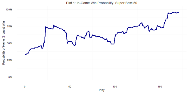
To replicate WPA on my own data, I took every play available from Armchair Analysis (All plays since 2000 season) and, using metrics such as Vegas spread, score, time left in game, field position, and quarter, used a GBM classifier to predict the probability of a home win for each play (BTW shoutout to H2O for making this extremely easy to do). With some simple data wrangling, I could figure out the Win Probability for each play in the database and how each player affected their team’s win probability. This is probably familiar to most, but I posted an example game in Plot 1: That’s the in-game win probability chart for Super Bowl 50.
Since it’s the offseason (kind of) and ranking players is the thing to do right now, how did 2015 QBs stack up against one another, factoring in both passing and rushing? On a personal note, my 49ers are in the middle of a QB battle (if you can call it that?); Blaine Gabbert and Colin Kaepernick had fairly similar stats last year, will this metric provide some separation between the two? Plot 2 has the answer to that.
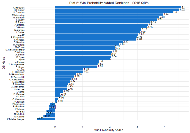
No surprise, but Aaron Rodgers and Carson Palmer lead the way with Matt Cassel and Zach Mettenberger bringing up the rear. Two things initially stand out to me. First, I knew Kirk Cousins had a really good season, but I did not expect to see him #3 on this list. Second, I knew Peyton Manning wasn’t great last year, but I did not expect to see him so low. As for the 49ers, the first takeaway is that both options aren’t great, but this metric gives the edge to Kaepernick.
Let’s dig a little deeper into the Blaine Gabbert-Colin Kaepernick comp. Because this data is play by play, we can plot the distribution of each QB’s WPA. That is shown in plot 3.
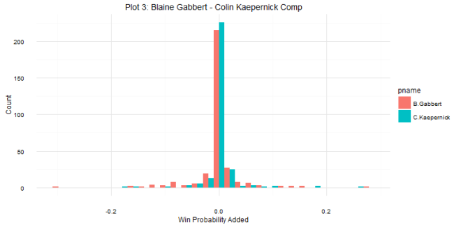
While the two distributions don’t look radically different, a few things stick out. Gabbert is really hurt by outliers; even though Kaepernick threw multiple pick-6’s in week 3, they don’t hurt him too bad because a)they were thrown early in the game and the team still had a chance to make a comeback and b) the team was not favored to win the game, so their win probability was fairly low to begin with. As you can see, most plays don’t have a huge impact on the game, but Gabbert has a higher proportion of these types of plays on the negative side. I’d have to looker deeper into these numbers, but I imagine a lot of his checkdowns while the team was trailing explains this.
Blaine Gabbert and Colin Kaepernick aren’t great QBs, so looking for differences in their WPA distributions is a bit like splitting hairs. What does a good QB look like in comparison to a bad one. To do this, I compared Blaine Gabbert to Tom Brady in Plot 4:
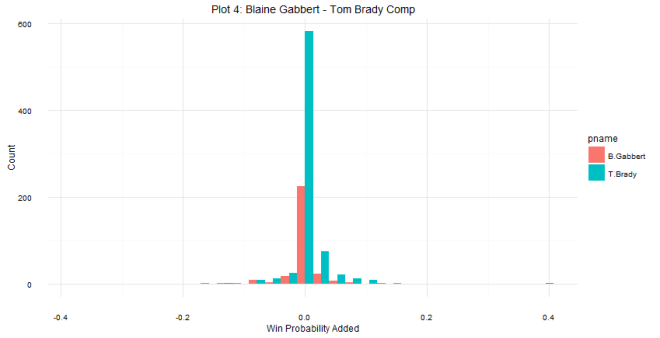
It can be tough to give a full comparison of these two because Gabbert only played half the team, but you can definitely see some differences here. Brady is helped by a big positive outlier, but also due to the fact that a much higher proportion of his low-effect plays are positive; Brady consistently increases his team’s chance of winning, even if it’s just by a little bit.
There’s a lot more to unpack with this data, and I’m excited to dig in more in the future. For example, which QB had the best WPA season since 2000? We can also look at other positions, which RBs, WRs, TEs, or Defenses had the best WPA? Which penalties had the biggest cost on WPA? This was my first foray into football analytics and it was a lot of fun! I hope to answer some more of these questions on the blog in the future.
Code at my Github
